With more than 55% of web traffic coming from mobile devices, a website that looks great on every screen size is no longer optional—it’s a business imperative. Below we explore the benefits of responsive design for small businesses and how LCValley Web Design implements it.
What Is Responsive Design?
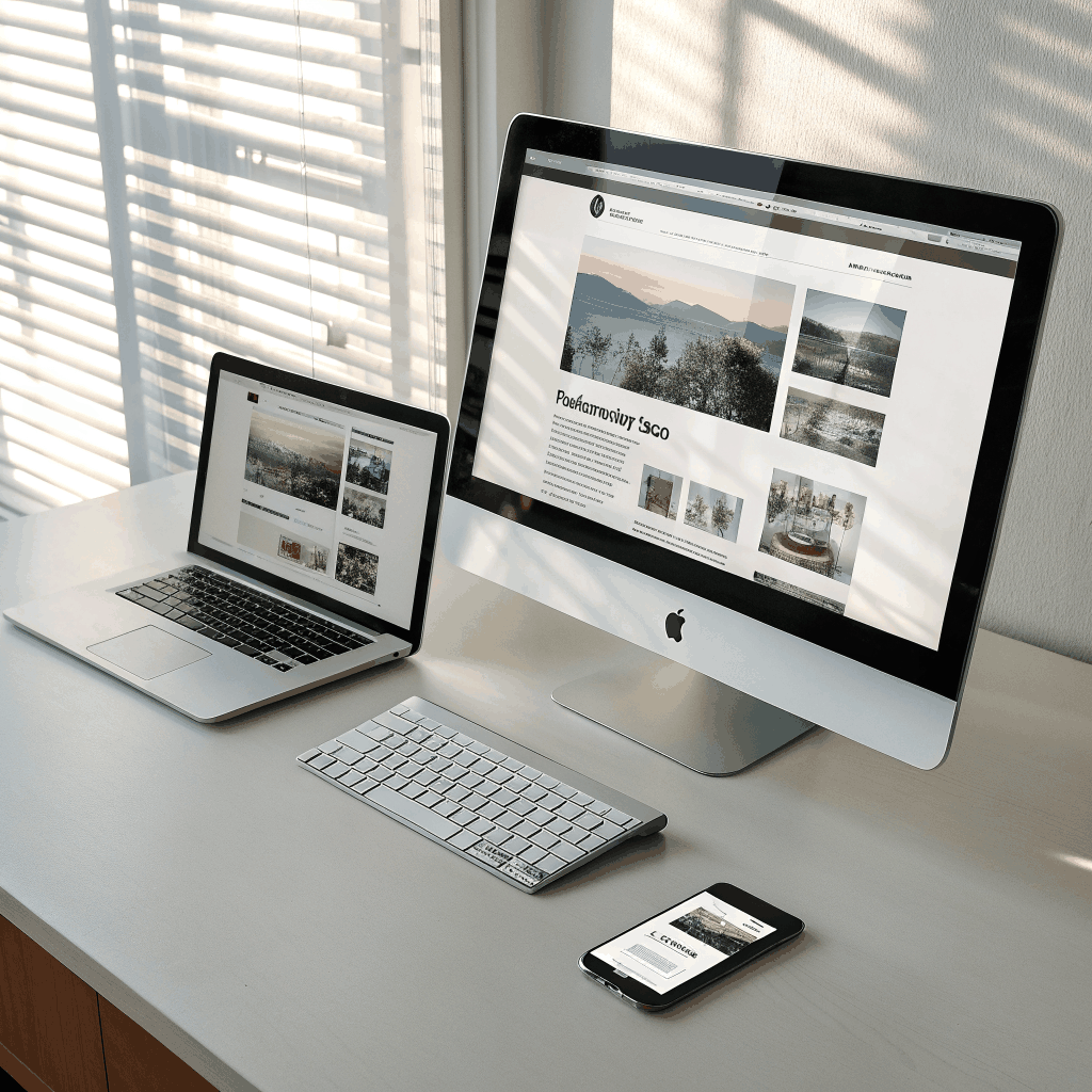
Responsive design means the layout and content of a website automatically adjust to fit the screen it’s viewed on—whether that’s a desktop monitor, tablet, or smartphone. This is achieved through flexible grids, media queries, and scalable images.
Key Benefits for Small Businesses
- Improved User Experience: Visitors can easily navigate, read, and interact with your site on any device, reducing bounce rates.
- Better SEO: Google ranks mobile‑friendly sites higher in search results. A single responsive URL simplifies crawling and indexing.
- Cost Efficiency: One website serves all devices, eliminating the need for separate mobile or desktop versions.
- Higher Conversion Rates: A seamless shopping or booking experience on mobile can increase sales and leads.
Responsive Design Best Practices
1. Use a Mobile‑First Approach
Design the smallest view first, then expand outward. This forces you to prioritize essential content and functionality.
2. Prioritize Readable Typography
Choose fonts that scale well and ensure line‑height and spacing remain comfortable on small screens.
3. Optimize Images
Serve appropriately sized images using the srcset attribute, and compress them to reduce load times.
4. Keep Navigation Simple
Implement a collapsible “hamburger” menu for mobile and ensure touch targets are at least 48 px × 48 px.
5. Test Across Devices
Use tools like Chrome DevTools, BrowserStack, or real devices to check for layout issues.
Our Responsive Design Process at LCValley Web Design
We follow a proven workflow:
- Discovery: Identify the primary audience and devices they use.
- Wireframing: Create mobile-first wireframes to map out content hierarchy.
- Design: Apply brand colors, imagery, and responsive typography.
- Development: Build with WordPress and a flexible theme, using CSS Grid and Flexbox.
- Testing & Launch: Perform cross‑device testing and go live.
Ready to future‑proof your website? Contact LCValley Web Design for a responsive redesign tailored to your business.